Saturday 28 March 2020

Advertising case study 3: Audrey Hepburn Galaxy advert


1) Who is Audrey Hepburn?

Audrey Hepburn was a huge Hollywood star in the 1950s and 1960s. She was associated with Hollywood glamour and style and was also a fashion icon and model. She died in 1993 at the age of 63.

2) Why did Galaxy select Audrey Hepburn for this advert? 

Galaxy selected Audrey Hepburn for this advert to celebrate the year of he hit film - ' Roman Holiday ' . (I think)

3) What are the connotations of Audrey Hepburn and celebrity in this advert? 

The connotations of Audrey Hepburn and celebrity is that their chocolate is amazing and delicious because as we can see, Aubrey 's dressed perfectly and is put in loads of makeup to represent how perfect this chocolate is. The use of a celebrity clearly indicates that the producers are trying to say - If you try their product, you're guaranteed to like it because if a celebrity likes it, you definitely will too. 

7) Which of Propp's character types are represented in the advert? (Note: you will not find them all).   

  • Hero
  • Helper/sidekick

8) How does the advert's narrative (story) follow Todorov's theory of equilibrium?

The adverts narrative follows Todorov's theory of equilibrium because at the start, there are a bunch of passengers. Audrey Hepburn the comes across a man who she immediately falls in love with. They then drive off and she eats her chocolate. 

9) What representations of gender can you find in this advert?

What does this mean and doesn't that mean the same thing as a stereotype? I'm a bit confused...

10) Are stereotypes reinforced or subverted in the Galaxy advert? Give examples.

I can see the stereotype of a lady falling in love with the man (this could link to her red lipstick, as red connotes love). The idea of a man being the saviour is also a subverted stereotype.

Advertising case study 2: Represent NHS Blood campaign


1) What does BAME stand for?


BAME stands for black and minor ethnicity.

2) Why is there a need for blood in the BAME community? 

There is a need for blood in the BAME community because not many black/asian people are blood donors. 

3) What does this advert want people to do once they've seen it (the 'call to action')?

This advert wants people to understand that they could make a difference to somebody's life if they give blood. It also wants people to know that black and asian people aren' doing enough for people in need. 

4) Why is the advert called 'Represent'?

The advert is called represent because it wants to represent the idea of different ethnicity and people.


5) Why have the producers chosen famous BAME celebrities to feature in the advert? Give an example of three well-known people who appear in the advert and why they are famous.

The producers have chosen to star famous BAME celebrities because if somebody looks up to any of these celebrities, they'll automatically think - Oh he/she 's doing this, maybe it would be a good idea if I did too.

6) Why is there a slow-paced long shot of empty chairs at the end of the advert?

There is a slow-paced long shot of empty chairs at the end of the advert because the producers want us to really take in the fact that nobody from different ethnicity are helping people in need by donating blood, and so they are trying to say that we need more people.

7) How does the advert match the key conventions of a typical urban music video?


  • It's surrounded by walls
  • It's quite quiet and plain.
  • It's not really looked after as much. ?
(I'm not sure about any others).

8) How does the advert subvert stereotypes? Give three examples (e.g. ethnicity, masculinity, femininity, age, class, disability/ability etc.) 

In some people's eyes - it makes Black/Asian people look bad because it comes across as if Black and Asian people are useless and unhelpful. Also, some people may not feel comfortable with the idea of giving your blood to somebody else.

9) How does the advert reinforce certain stereotypes of the BAME community? Could there be an oppositional reading where some audiences would find this advert offensive or reinforcing negative stereotypes?

I'm not sure...

10) Choose one key scene from the advert and write an analysis of the connotations of camera shots and mise-en-scene (CLAMPS).

I'm not sure how to structure this...

Thursday 12 March 2020

Advertising case study 1: OMO print advert


1) What year was the advert produced?

This advert was produced in 1955


2) How were women represented in most adverts in the 1950s?

Women were represented in most adverts from the 1950's as domestic housewives that do all the work in houses.

3) How does the heading  message ('OMO makes whites bright') and typography promote the product?

The heading message and typography promote the product because the typography is in a Sans-serif font which is a basic font but it attracts an audience because people think white is a perfect colour after you wash the clothes but knowing that your clothes can be even whiter makes people want to buy the product because it is different. 

4) Analyse the mise-en-scene in the advert (CLAMPS): how is costume, make-up and placement of the model used to suggest women's role in society?

The use of the red lipstick suggests that she is very lady - like and it could convey that she is in love with the product (as red connotes love). What the model is wearing was worn back in the day because it was a traditional outfit for women, especially women who did a great deal of work in
houses. The placement of the model is a typical stereotype of women, this is because the lady is hanging up clothes which clearly indicates she is doing work for the house.

5) Why is a picture of the product added to the bottom right of the advert?

A picture of the product is added to the bottom right because when people read they will look for positive information about the product before they see the actual product. Therefore, people will then see if the product is worth buying.

6) What are the connotations of the chosen colours in this advert?

The connotation of red consists of: love and excitement
The connotations of yellow are: happiness, joy and energy
The connotations of white are: goodness and purity

7) How does the anchorage text use persuasive language to encourage the audience to buy the product? Give examples.


The anchorage text (whiteness alone won't do) clearly suggest that the advertisement is trying to tell us that if you buy their product, your clothes will immediately be the perfect colour after they've come out the wash. 

9) What is the preferred reading for this advert - what did the producers of the advert want the audience to think in 1955?

The preferred reading of this advert is that all women should be working in the house and only they are the people who get excited about washing. Therefore, this advertisement is saying that if you buy their product, your wife will be happy (shown in the lady's facial expression). 

10) What is the oppositional reading for this advert - how might a modern audience respond to this text and the representation of women here?

The oppositional reading of this advert is that women should not be used as models in adverts that promote cleaning products because women should be able to do anything they want, not just be housewives. Therefore, this may come across as offensive to many women because of the way society saw women. 

Thursday 5 March 2020

Gender stereotypes in advertising

1) Find three adverts featuring women that are from the 1950s or 1960s. Save the images to your Media folder as jpegs and then import them into your blog post. Hint: You may wish to look at car, perfume or cleaning products but can use any product you wish.


2) Find three adverts featuring women that are from post-2000. Save the images to your Media folder as jpegs and then import them into your blog post.


3) What stereotypes of women can you find in the 1950s and 1960s adverts? Give specific examples.

  • In the advert for Agee Pyrex, the stereotype of women that we see is that women are domestic housewives. This is shown in the anchorage text " Successful marriages start in the kitchen ". We can clearly see that the women is more inferior to the man because she is at a lower level than him.         
  • In this advert, we can see a man relaxing in his bed whilst a lady serves him on her knees. the stereotype of women here is that women are servants for the man. The small grin on the man's face indicates that he's happy she's doing work for him. Women were used as domestic housewives which conveys what the advert is trying to communicate to the audience.
  • In the Budweiser advert, we can see a women serving a man as he sits and does work. The stereotype of women here is that Women should be doing things for a man and that Women are less inferior than men.
    4) What stereotypes of women can you find in the post-2000s adverts? Give specific examples.

    • In the Reveal: Calvin Klein advert, the stereotype here is that women are seen to be like sex toys (this is shown where the lady has herself in the mans hands; naked). Women are also less inferior than men as the man looks powerful and the Women is only there to fulfil his need. Therefore, the producers are trying to communicate to the audience that if men wears this perfume, women will instantly fall in love with you.
    • In the Victoria's secret advert we can clearly seen that all the women shown on the front cover are undeniably slim, this links to the sub-heading as the sub-heading says ' I love my body ' because the producers are saying that you may well love your body but the key to that is by being extremely slim. The stereotype of women is that the only way you'll get people's attention is by being thin and beautiful. This reinforces the stereotype of women only being lovable if they're sexually attractive?
    • In the advert for Barbie, we can see a girl glazing up which links to what the slogan says ' dream with your eyes wide open '. This indicates that the message that Barbie are trying to send out to people is that girls (especially) can be anything they dream of. This also links to back in the day when women were seen less superior than men and were mainly supposed to do work around the house. Barbie are trying to say that nobody is allowed to tell you what to be because you are in charge of yourself/your own life, which is empowering young girls to change their lives for the better.
    5) How do your findings suggest representations of gender have changed over the last 50 years

    Representation of gender has changed over the last 50 years because women are more equal than they were before. This is especially seen in the advert for Barbie, where the slogan says ' dream with your eyes wide open ' and the main image is of a girl. Back in the day, many people didn't believe ladies/women could have certain jobs such as: A pilot, an engineer, a builder etc. Many women are now able get these jobs with the right qualifications which is a massive change to society as these were seen mainly as masculine jobs before. 

    Wednesday 4 March 2020

    Advertising and Marketing: Key conventions


    1) What key conventions of an advert can you find and what are the connotations of each one?
    • The brand name (JillStuart) is in bold, this connotes that they want people to know who they are. The grey used for the title suggests that this print advert's product is sophisticated and has quality.
    • They used an image of a lady and lemons. The use of an image of a lady dressed in all white suggests that this product is full of goodness and it's almost perfect. The yellow connotes joy and happiness and the green connotes freshness.
    2) For each convention, write about how this appeals to a target audience. 

    The brand name appeals to the audience because it is eye catching as it is in bold. The use of the yellow appeals to the audience because yellow is known to be the happiest colour. Therefore, it makes the reader feel that if you buy JillStuart's product, you'll feel nothing but happiness.

    3) What is the USP (unique selling point) of the product and how do you know?

    The USP of this product is the fact that they added an image of lemons and as we can see in the lady's hand, she is holding the perfume they are selling against the lemons. This shows that the product doesn't need to be amazing, it just needs to be simple yet useful.

    Find a an example of a print advert for EACH of the following:

    1) A clear brand identity

    Image result for nike just do it advert


    2) A shocking or controversial idea


    Image result for a shocking controversial advert

    3) An emotional connection to audience


    Image result for emotional advert


    4) An innovative or ‘different’, subversive concept (e.g the porcupine advertising VW car)


    Image result for innovative advertising examples

    5) A foreign advert that you can understand despite the language barrier

    Image result for foreign advertisement

    Description:

    1st picture - The use of the logo and slogan is clear to an audience since Nike is a well-known brand. They do not have to write their brand name because people can clearly see what brand it is. (other brands write their brand names and nike do not have to).

    2nd picture - The use of a black man behind a white person's face clearly indicates that in the eyes of many other people, we must act like white people to be accepted.(usual adverts wouldn't do this)

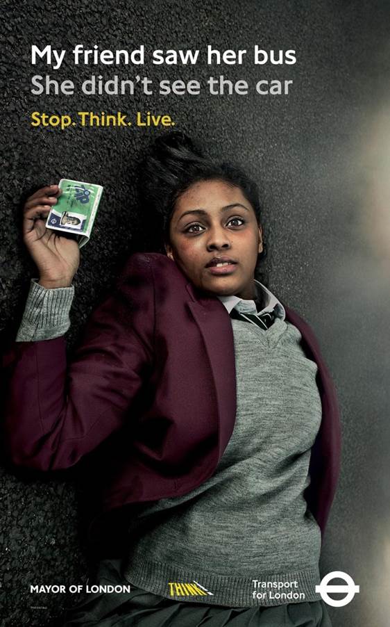
    3rd picture - The use of a girl on a ground in the middle of a road clearly conveys that the road and streets is a dangerous place and you must be extremely aware of the way you drive. (the use of the slogan ' My friend saw her bus. She didn't see the car. ' isn't a usual slogan).

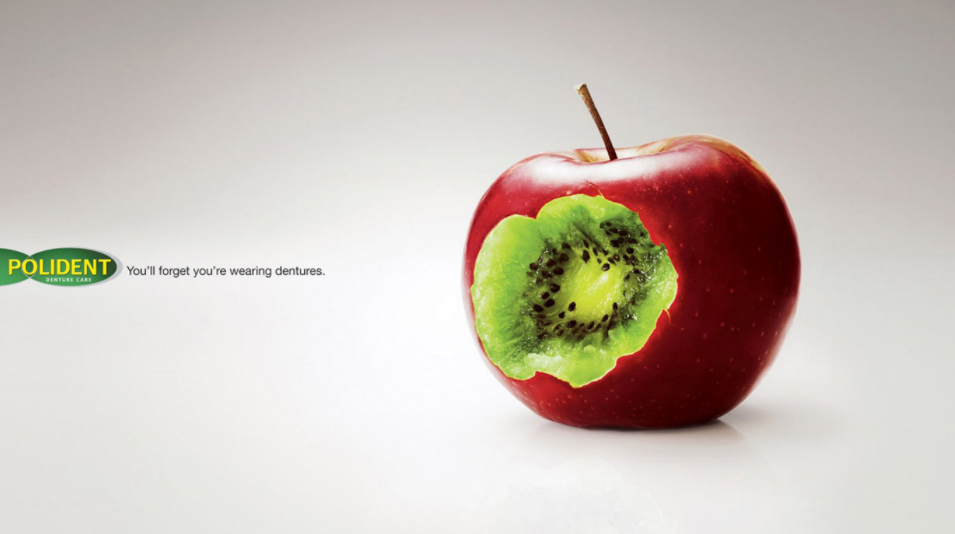
    4th picture - The use of the Kiwi inside an Apple clearly indicates that if you get Pollident, you'll feel nothing but softness of the fruit you're eating. This is a USP because it isn't an ordinary fruit or idea.

    5th picture - In this last advert, we don't understand the words but we do understand what they're selling. The use of the Coke with a red background shows us that it is a powerful drink. The red also connotes love. Therefore, the readers understand that what the producers are trying to tell us is the fact that if you get this drink, you'll instantly fall in love with it.